Kitchen with an area of 9 square meters. m - current design 2018
A kitchen with an area of 9 square meters is the golden mean for most Russians living in apartment buildings. In apartments of the last century, kitchen spaces with an area of more than 6.5 square meters were rarely found. In modern dwellings with an improved layout, kitchens increasingly have an area of more than 10 square meters. m. Designers have long proved that a kitchen with an average area can be not only multifunctional and practical, but also a beautiful, fashionable and stylish room. With such an area, you do not have to save every centimeter of usable space, but there is simply no right to make a mistake in planning, choosing household appliances and organizing a work and dining area. After all, the kitchen is the most popular place in any home, requiring a practical, ergonomic, functional and aesthetic design. We hope that our extensive selection of design projects for kitchen spaces will help you create a dream interior and introduce your own design ideas based on the proposed options.
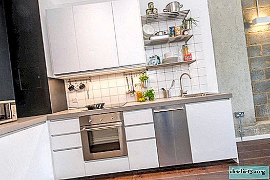


Furniture ensemble layout options
Nine square meters of kitchen area can be differently distributed in the space of an apartment or house. The choice of layout of storage systems, household appliances and work surfaces will depend on the following factors:
- room shape;
- the number, size and location of window and door openings;
- the location of the kitchen relative to other adjacent rooms, the kitchen area can be part of the combined space, living room;
- passing communication systems (not in all cases it is possible to legally transfer one or another pipeline);
- the need to equip the dining area as part of the kitchen;
- the ability to install a washing machine in another room in the home.


Obviously, the location of the kitchen set largely determines not only the appearance of the room, but also its functionality, practicality and ergonomics. If you have to spend a lot of time on working kitchen processes, but they should take place in a comfortable and safe environment.


Corner layout for a medium sized kitchen
Angular layout is not in vain considered the most versatile and practical. At the lowest cost of useful kitchen space, it allows you to place a sufficient number of storage systems and work surfaces. L-shaped layout is ergonomic (we place the sink and plate on the perpendicular sides), it is convenient from the point of view of the least cost of traffic and looks attractive. Another advantage of the corner layout is that even in a small space of the kitchen there is enough space for a small dining group.


The corner layout is very compact. Therefore, it is often supplemented with a kitchen island - a stand-alone module that can serve as a storage system, a place for the integration of household appliances and a sink. Lengthening the island's countertops allows you to organize a small dining area for short meals or as a permanent meal for two or three people (depending on surface size).


The peninsula differs from the kitchen island in that one of the sides is attached to a wall or kitchen unit. The peninsula becomes an excellent solution for small rooms that need additional furniture to maintain order in the kitchen. It can also be used as a storage system, a base for the location of household appliances and a place for short meals (in some cases, as a permanent dining segment).


Layout in a row
Depending on the shape of the room and the location of the entrance and the window, a single-row (linear) layout becomes an excellent option for arranging the working area of the kitchen. Such an arrangement of the kitchen set is suitable for those families who need a small number of storage systems and do not need to integrate a large number of household appliances or can be limited to a standard set of devices of compact models. The obvious advantage of arranging the furniture ensemble in one row is the free space of the kitchen for installing a spacious dining table or a comfortable kitchen corner.


In a linear layout, it is difficult to fulfill the ergonomic arrangement of the “working triangle”. Even if you put the refrigerator separately from the kitchen, it still turns out that the sink and stove (hob) are located in one row. Therefore, the linear layout is often complemented by the installation of an island or peninsula. Most often, a hob is integrated in this module, sometimes a sink (it all depends on the possibilities of transferring communication systems).


U-shaped kitchen unit
In some cases, the U-shaped layout becomes the best way to arrange a kitchen ensemble. If the room is very elongated and there is no need to install a dining table, but to maintain order you need a large number of storage systems and household appliances, the U-shaped kitchen set will provide such an opportunity. In such an arrangement, it is not difficult to comply with the “working triangle” rule by placing the sink, refrigerator and stove (hob) on opposite sides of the furniture ensemble.


If the kitchen is rectangular and all the more elongated, then hardly after the installation of the U-shaped kitchen set there will be space for a dining group. But in the rooms, whose shape is close to the square, you can set up a small island in the center (it can also serve as a place for short meals) or a modest-sized dining table with small stools that easily slide under the countertop.


Parallel layout
If your kitchen is a passage, if it has a balcony or panoramic window or is simply presented in the form of a very elongated rectangle, then a parallel layout of the furniture ensemble may be the only effective solution. The arrangement of storage systems, household appliances and work surfaces opposite each other, in two rows, will saturate the kitchen with the necessary interior items and preserve the ergonomics of the room. If the room is very elongated, then, most likely, in the center it will not be possible to establish a dining group even of compact size. But in a room whose shape is close to a square, you can install a small rack, a portable dining table.


Organization of a dining area in a kitchen of 9 sq.m
The choice of how to organize the dining area in the kitchen space will depend on the following factors:
- the number and age of family members (a bar or an extension of the kitchen island countertop will be sufficient for a married couple; a full dining table is needed in families with older people and young children);
- lifestyle (someone prepares half a day for a large family, while someone eats mainly in catering and uses the kitchen only for short meals);
- the need for an additional furniture module for integrating a household appliance or sink (an island or a peninsula can become an effective dining area for 2-3 people);
- the amount and shape of free space remaining after installing the kitchen unit.


Not always within the kitchen space with an area of 9 square meters it is possible to comfortably arrange a dining group for several people, without prejudice to the rest of the situation. The room can be very elongated, have two windows (this is a plus from the point of view of lighting, but a minus from the side of hanging cabinets and the subsequent lack of storage systems), the kitchen can be a walk-in room or have an irregular shape with niches and ledges.


A traditional option for organizing a dining segment is setting up a table with chairs for all family members. This option is possible with angular or linear layout of the kitchen. For a large family in which there are elderly people, small children, a lunch group is necessary. It is best to use a dining table of a round or oval group - so it will be possible to place the maximum number of family members in the minimum number of square meters of the kitchen.


If the kitchen is not enough from the point of view of saturation of the room with storage systems and places for embedding household appliances, then using the island can help with this. It is logical that after installing the kitchen island there is not enough space for a dining group. If the family consists of two or three people, then the dining area can be organized behind the countertop of the island, slightly extending it for a comfortable seating arrangement.


Another option for creating a dining area within the kitchen is the installation of a soft corner. Comfortable, practical, aesthetically pleasing and quite affordable for a small kitchen room with an area of 9 square meters. m. It is designers who most often emphasize the design of the kitchen corner, if such is present in the interior of the kitchen - it can be a bright upholstery and a table with an original design and its surroundings (chairs or stools)


Finishing and color schemes in a medium-sized kitchen
The choice of finishing materials for such a peculiar room as a kitchen must be chosen based on the following features:
- high humidity;
- frequent temperature changes;
- sedimentation of droplets of fat floating in the air is possible;
- mechanical effects (to a greater extent for flooring).


From this small but important list of criteria, we can conclude that materials for finishing the kitchen space must not only withstand high humidity and temperature, but also be cleaned with chemicals and at the same time not lose their original appearance. As for the design of the floors, the coating should, among other things, withstand the fall of sharp and heavy objects.


If your kitchen area with an area of 9 square meters is part of the combined space, then the decoration can serve as an element of zoning. Of course, the kitchen segment located in the living room will have a design that is accepted throughout the space, but it can be distinguished using the level of the ceiling or floor, the accent design of the kitchen apron. It all depends on the chosen style and method of decorating walls, ceilings and floors.
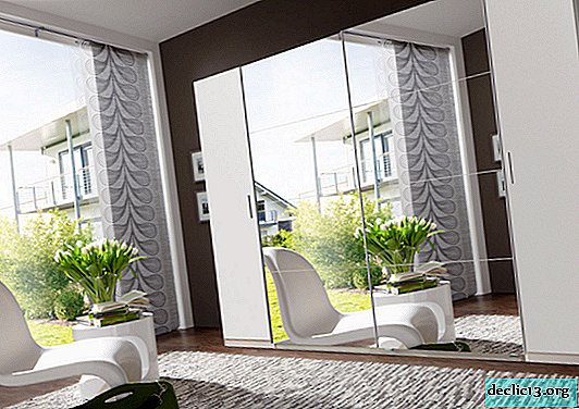
If we talk about current color solutions, then for medium-sized kitchens, designers recommend using light shades for wall decoration. The classic ceiling design is snow-white white. But for the flooring you can apply dark, deep tones. Such a layout in tone will help visually increase the height of the room. On a light background, a kitchen set of any color will organically look.


White color is always relevant, whether it is the choice of background for the kitchen room or the option of execution of kitchen facades. In some cases, it is necessary to use white surfaces totally - the kitchen is located on the north side, plants or buildings block the light from the window, the room has an irregular shape with many niches and ledges, and an attic space. White color will help not only smooth out architectural imperfections, visually expand the volume of the room, but also make the image light, airy.


Gray color does not go out of fashion. A universal, practical, noble, easily combined tone can become not only an excellent background for a kitchen set, but also be used to make cabinet facades. A kitchen in gray tones will not look boring if you add a couple of bright accents. This can be the design of a kitchen apron, bright dishes, a tablecloth on a dining table or a colorful upholstery on chairs (bar stools).


Contrast combinations are a popular trend in the design of kitchen spaces. A medium-sized kitchen can afford a combination of dark fronts of the kitchen unit with light wall decoration. If you use a dark color to design the lower tier of cabinets. And the light tone is for the top, then you can create a visual increase in the height of the room. Contrasts help not only to emphasize the geometry of the room, to highlight especially significant segments or interior items, but also to give the image of the room dynamism and even drama.


Designers recommend "diluting" contrasting combinations (alternating dark and light surfaces) with an intermediate tone. Most often, as an intermediary between light and shadow, interior items and surfaces made of wood are used. The natural warmth of wood not only raises the degree of character of the design of the room, but also makes it more cozy, comfortable.


In medium-sized rooms, experts allow the use of colorful natural shades. Olive and pistachio, menthol and turquoise, sand, golden, pale blue or a complex dark blue shade can be used as a color scheme for decorating an accent wall, a kitchen apron or a pattern of motley porcelain stoneware.


